If you’ve ever come across a powerful dataset and thought it could be more impactful as a map, you’re not alone. Maps can reveal patterns, highlight disparities and help audiences connect with information in ways that plain numbers can’t. But building those maps from scratch often feels out of reach, especially without coding experience.
That’s where the Knight Center’s new low-cost advanced course comes in.
Join us for Hands-On Mapmaking for Journalism / 2025 Edition, a four-week online course running from June 2 to 29, 2025, where you’ll learn how to turn raw data into interactive, customizable maps—no coding required. Using free, open-source tools like Protomaps and Datawrapper, you’ll develop the skills to find and prepare geographic data, make thoughtful design choices and publish maps your audience can explore.
Registration is now open for just US $95. Join today and invest in your mapping and storytelling skills! The course runs from June 2 to 29, 2025.
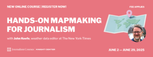
Hands-On Mapmaking for Journalism / 2025 Edition is taught in English by data and mapping expert John Keefe, weather data editor at The New York Times who works on visual stories that help audiences understand everything from hurricanes to heat waves. His previous work at The Times includes coverage of the 2020 election and contributions to the newsroom’s Pulitzer-winning coverage of the pandemic. Keefe has also led data and visual teams at CNN, Quartz and WNYC, where he built and ran the Data News Team.
The course material is organized into five modules covering various topics through video classes, readings and discussion forums:
Introduction Module: Getting set up with class data, plus guidance on finding your own
We’ll begin by examining the power of maps in journalism through iconic examples and projects from your instructor, John Keefe. Then, we’ll get you set up with the tools and data you’ll need and guide you in choosing your own dataset to work with throughout the course.
Upon successful fulfillment of the course requirements, you’ll receive a certificate of completion, recognizing your new skills in mapmaking for journalism. Additionally, there will be live sessions where you can ask John Keefe directly about any issues or challenges you encounter during the course. For those who can’t attend the live sessions, they will be recorded and made available for you to watch at your convenience.
Whether you’re mapping voting trends, local infrastructure, public health data or climate patterns, this course provides you with the tools to quickly turn raw numbers into meaningful visuals.
Register now and start creating maps that do more than inform—they invite your audience in.


